Tree Dispersion in Local TN Park

Retrieved from giphy.com

Introduction

Diversity is very important. Understanding why diversity is lost is important to understanding the overall health of ecosystems. Observe the major difference in diversity between a grassland and a forest habitat; the forest habitat is much more diverse. Forests are not homogeneous throughout, i.e. diversity increases as you move from the edge to the middle of the forest. Forest edges receive more attention thanks to human activity forming more edges. This habitat fragmentation can reduce diversity among species (Beasley, 2019).

Using a systematic sampling transect we can understand the changes in diversity from the forest edge to the middle of the forest. A transect is a process that takes samples along a straight line with a goal to observe the changes in diversity along that line. The transect line can vary in length, anywhere from a few meters long to a hundred meters long. There are two kinds of transect sampling methods: a line transect where the individuals touching a meter length of string stretched along the transect are recorded; and a belt transect where quadrants are placed at intervals along the transect and organisms in each quadrant are recorded. The line transect is more convenient but generates less complete data while the belt transect is more strenuous but generates more complete data (Beasley, 2019).

Method

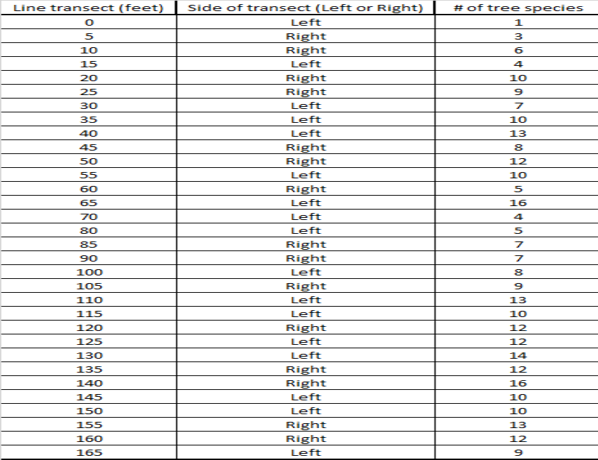
For our lab we used the line transect sampling method to assess tree species diversity from the forest edge to the middle of the forest at Stringers Ridge, an urban forest, here in Chattanooga, TN. Our group members were Will Foushee, Luke Mainello, and myself. We used a transect tape to make a 50 meter (165 ft) line from the hiking trail to the forest interior. We then tracked the amount of different tree species every 1.5 meters (5 ft) using the string provided. We determined which side of the transect line to sample by flipping a coin. We were able to identify the tree species by using the tree guide provided. Afterwards we used the data to make a scatter plot showing change in tree species diversity starting at zero m, the forest edge, to 50 m, forest interior.

Retrieved from giphy.com

Results

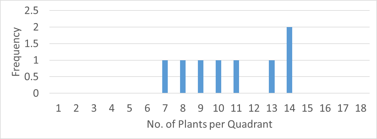
Analysis of the data collected show a small, non-significant relationship between the forest gradient (distance from forest edge to forest interior) and species richness. Our R^2 value of 0.31 is closer to 0 than it is to 1.

Figure 1: Species richness appears to grow along the transect.
Figure 2: The R^2 value of 0.31 shows a small relationship between species richness and forest gradient (ft).

Discussion

1. Provide an overall description of the habitat. Some characteristics you may consider include: soil condition, evidence of disturbance, temperature, light intensity, tree size, water condition, etc. The habitat varied in elevation, i.e. it was very sloped. The soil appeared to be dry and compact. There was evidence of disturbance, e.g. fallen trees, but there’s no way to discern what caused the disturbance. The disturbance did not appear to be human caused. The temperature was high enough to make me roll my sweater sleeves up, so mid- to high 70’s (degrees Fahrenheit). Light intensity was strong at the beginning of the trail, but where we started our transect it was fair. The end of our transect had minimal light intensity. Trees varied in size; most were samplings and the largest had a diameter of only 2 to 3 ft. The habitat appeared to have minimal water signs; other than the growth of the trees.

2. Based on your scatter-plot, what pattern did you observe in tree species diversity as you moved from the edge of the forest to the interior? Does the pattern have a strong or weak effect on number of tree species? How do you know? The scatter-plot showed a non-significant relationship between the forest gradient and the species richness, but it obviously shows that diversity rose the further we went into the forest interior. The weak pattern is shown by the r^2 value of 0.31, which is closer to 0 (which shows no pattern) than 1 (which shows a definite pattern).

3. Run a regression analysis in Microsoft Excel on your data. In Data Analysis, select regression. Select the line transect values for the Input X range and number of tree species for the Input Y range. Explain whether or not the relationship is statistically significant. After running the regression analysis, a resulting p-value of 3.63E-06 was displayed. Because the p-value is so low the relationship is not statistically significant.

4. As the terrestrial environment becomes increasingly fragmented, what patterns in tree diversity might you expect to see based on your results? What follow up questions do you have for a future study? Based on my results, I believe that diversity patterns in trees will slowly decline with more habitat fragmentation. To follow up I would ask, “What recent events, biotic and abiotic, could have disrupted the community?”

Read the article, “Gene Flow Halted by Fragmented Forests”

1. According to the article, why is the conservation of river floodplain ecosystems important? Because river floodplain ecosystems help maintain water quality. They also help prevent erosion and provide important habitat for wildlife (Saeki, 2018).

2. Explain why gene flow is important for monitoring endangered species such as Acer miyabei. How does landscape genetics help to understand gene flow patterns? Because less gene flow between populations will possibly result in the disruptive (i.e. diversifying) natural selection which favors two or more extreme phenotypes over the average phenotype. This disruptive selection could lead to two or more distinct sub-species. Landscape genetics helps to understand gene flow patterns by analyzing the DNA of similarly aged species and comparing the different ages’ DNA (Saeki, 2018).

3. What were the overall findings of the study? How does such research inform our conservation and restoration efforts? The overall finding was that the older trees had more similar phenotypes because they once coexisted in the same habitat, and that younger trees’ DNA were more varied do to isolating populations from habitat fragmentation. This research helps inform scientist the overall effects of habitat fragmentation on species’ DNA and the changes the DNA are evolving towards (Saeki, 2018).

Cited References

Saeki, I., Hirao, A. S., Kenta, T., Nagamitsu, T., & Hiura, T. (2018). Landscape genetics of a threatened maple, Acer miyabei: Implications for restoring riparian forest connectivity. Biological Conservation,220, 299-307. doi:10.1016/j.biocon.2018.01.018

International Cat Tracker: Home Range

retrieved from giphy.com

Introduction

An animal’s home range is the actual physical area covered during the animal’s daily activities; like searching for food, finding shelter, and seeking mates. Home ranges may overlap unlike territories. Animals do not defend their home ranges against intruders of their own species. A territory is an area that is defended, and is typically a smaller area within an animal’s home range. Their are few species that carry out all their daily activities within a defended territory, i.e. territory is equal to home range. This is more typically the case during breeding seasons.

The resource dispersion hypothesis is a general ecological trend that explains an animal’s home range by it’s demand for resources and the local distribution of resources in the environment. E.g. If resources are thinly distributed, an animal must travel farther to retrieve the same amount of nutrients compared to an individual living in a environment where food resources are more densely concentrated. By observing home ranges we can observe the quality of the environment, i.e. home ranges will be smaller in resource-rich habitats and larger in those that are resource-poor (Beasley, 2019).

Using Radiotelemetry, a tracking method using a signal emitting transmitter that is attached to the animal to be observed and releasing the animal back into its home range, scientist can map out an animals home range over an extended period of time. The resulting map shows an estimate of the major activity areas of the observed animal. The resulting map is an estimate because the animal will not always visit all major areas of its home range, and not all areas of the home range will be important. The underlying goal; estimating the probability that an animal will be found in a particular place (Beasley, 2019). This study is important because home ranges provide insight into the social organization, foraging behavior, and possibly the most important, limiting resources.

Method

In this lab we calculated, analyzed and compared the home ranges of domestic cats
in the United States, Australia and New Zealand by observing data comprised of cats released by citizen scientists who attached GPS collars to their cats as part of the Cat Tracker citizen science project.

The programs required for this lab are:

Google Earth Pro, MoveBank.org, EarthPoint (Select Calculate Polygon Area), and Microsoft Excel

First, we collected home range data from 15 cats in Australia, United States and New Zealand so that there was a total of 45 cats in the data set. Then, we made a bar graph to compare home ranges across the countries. Next, we combined the data with two other people’s data sets so there is 135 cats in the data set. Finally, we ran a one-way ANOVA using the combined data set.

Results

The ANOVA test in figure 3 shows a p-value of 0.02 < 0.05, indicating there is a significant difference between the average home ranges. This indicates that the home ranges of cats are much greater in urban environments compared to rural.

Figure 1: The counties compared in column 1, the number of individual cats observed per country in column 2, the average home range (hectares) in column 3, the standard deviation of the ranges in column 4, and the standard errors in column 5. New Zealand is shown to have a much greater SD than Australia and USA.
Figure 2: New Zealand is shown to have an exponentially greater sum and variance than the other countries. This is because an individual cat in New Zealand had an outrageously large home range!
Figure 3: The p-value is 0.02 which is less than the alpha of 0.05. This indicates that there is a significant difference in the means of each home range.
Figure 4: New Zealand has the largest average home range followed by the USA. Australia has the lowest average home range and a minimal SE.

Discussion

Based on the observations in Google Earth, most home ranges in New Zealand and the U.S. were urban; both countries’ average home ranges consisted of: paved streets, concrete side-walks, and brick homes and other buildings like restaurants. In Australia the home ranges were primarily rural; consisting of more trees and fields of grass. As seen in figure 4 above, the more urban environments displayed greater home ranges compared to Australia’s more rural environment. This could be explained with abiotic factors such as the amount of automobile traffic and large buildings that prevent cats from traveling more efficiently. In the rural environments the home ranges are more efficient due to possibly ease of access and abundant resources. Biotic factors such as more competition and less prey in urban areas can explain why the home ranges are so large and vise-versa for rural environments. Since biodiversity is supported by nutrient rich environments I conclude that urbanization is bad for biodiversity, because the large home ranges show that resources are not as abundant. If I was to develop a city more cat friendly that supports biodiversity I would invest research into roadways that do not fragment habitats, e.g. underground roadways, and build elevated buildings, like the buildings you can find on the coast.

According to Peter Deplazes and colleagues’ article “Role of pet dogs and cats in the transmission of helminthic zoonoses in Europe, with a focus on echinococcosis and toxocarosis” people are at risk of being infected by parasitic worms because of very dense free-roaming dog and cat populations. Cats are more likely to be infected with E. multilocularis compared to dogs, because of their hunting of rats and mice. Cats have a lower worm burden then dogs because they tend to excrete exponentially less eggs than infected dogs (Deplazes, 2011). I.e. cats tend to get infected with parasitic worms more often than dogs, but spread less parasitic eggs than infected dogs. In comparison to my data from the lab, urban cats cover much more land than rural cats furthering the spread of parasitic worms. Also, wild cats and dogs tend to mingle with pet cats and dogs in the city furthering the spread of parasites and consequentially spreading them into the pet owner’s home.

retrieved from giphy.com

References

Deplazes, P., Knapen, F. V., Schweiger, A., & Overgaauw, P. A. (2011). Role of pet dogs and cats in the transmission of helminthic zoonoses in Europe, with a focus on echinococcosis and toxocarosis. Veterinary Parasitology,182(1), 41-53. doi:10.1016/j.vetpar.2011.07.014

Urban Ecology: Evolving Ant Diet (Updated)

Introduction

In an attempt to understand the effects of urbanization on ant diets, we analyzed data retrieved from the 2016, 2017 classes and our own 2019 data. All classes used the same research experiment. The research experiment used several different baits in varying locations around campus and, for our 2019 class, off-campus to observe the current local ant diet. Changes in ant diets may reflect how ants are adjusting to new environments and this can help scientist understand the effects on other species as well. If ants are adjusting their diets in accordance with urbanization, then we will see more ants foraging in locations with greater percentages of impervious surfaces than natural, grassy locations (Stahlshmidt, Z.R & Johnson, D. 2018).

Figure 1: My hypothetical scatter plot showing a strong interrelation between Impervious Surfaces and Total Number of Ants.

Background

Urbanization is a growing issue. “It is estimated that within the next forty years, two-thirds of the world’s population will live in expanding urban centers. Therefore, understanding and predicting changes associated with urbanization has become a focus of scientific research” (Beasley, 2019). In response to urbanization many species have shown a shift in diet, including wolves, birds, and ants! Changes in diets may have an impact on a species’ ability to adapt to a new environment. Ecologists have been assessing shifting diets by setting out baits of various nutrient types/ availability and track the abundance of different species at each bait.

Methods

The method the 2016 class used to collect their data is a rather simple, repeatable method. Working in groups of four, researchers used sample kits with the following: 1 box of zip-lock bags, five mason jars of liquid food baits (water, oil, sugar, salt, amino acid), index cards, flags, thermometer, plastic spoons, four ant experiment signs. Each group selected four sites (two green, low % impervious sites and two pavement, high % impervious sites) around the university campus. Researchers labelled each index card with the following: Group name, date, food bait, name of sampling location, green or pavement. Researchers then placed liquid soaked cotton balls on each index card and placed them on the ground. They secured the index card with a flag (green space) or rocks (pavement). The baits were left out for 1 hour. At each site, a thermometer was used to record the temperature (°C). The Pace-to-Plant method was used to calculate impervious surface. The Pace-to-Plant method is when a researcher takes 25 steps at a 45 degree angle from the food bait site. While walking the 25 steps they count the number of steps that land on impervious surface, pavement. The researcher does this in four directions, making an X through the food bait site. The total number of steps that land on impervious surface is equal to the percent of impervious surface around the food site, %𝑖𝑚𝑝𝑒𝑟𝑣𝑖𝑜𝑢𝑠 𝑠𝑢𝑟𝑓𝑎𝑐𝑒 = (# 𝑜𝑓 𝑠𝑡𝑒𝑝𝑠 𝑜𝑛 𝑝𝑎𝑣𝑒𝑚𝑒𝑛𝑡/ 𝑇𝑜𝑡𝑎𝑙 𝑛𝑢𝑚𝑏𝑒𝑟 𝑜𝑓 𝑠𝑡𝑒𝑝𝑠). After 1 hour, researchers collected cards, baits and ants into zip-lock bags and returned to lab (Beasley, 2019). All graphs and tables were developed in Excel and a one-way ANOVA was used to calculate the P-value.

Our 2019 class sampled off campus and did not use the amino acid bait.

Figure 2: Pace-to-Plant Method. Retrieved from http://ecoipm.org/2018/08/02/pace-to-plant-goes-regional/

Statistical Analysis

Figure 3: All experimental variables in statistical groups

The response variable chosen for my analysis is total ants. The mean, standard deviation (SD), and standard error (SE) of the 2016 response variable are listed respectfully: mean = 40.5, SD = 74.5, and SE = 15.2. The 2017 response variable’s mean, SD, and SE are listed in the same order: mean = 136.94, SD = 191.38, and SE = 47.85. The 2019 response variable’s mean, SD, and SE are also listed in the same order: mean = 5.4, SD = 9.84, and SE = 2.20.

2016 Results

The ants’ diets were observed to be more drawn to sweets like cookies and sugar. The impervious surfaces did not show to determine the total number of ants at each bait location. The null hypothesis is the alpha of 0.05, p-value must be less than 0.05 to imply a significant difference. The p-value for the bait data is 0.11 which is greater than the alpha. This shows that there is not a significant difference in the means of the bait preferences.

Figure 4: The ants were attracted to Cookie and Sugar baits. The ants were not as attracted to Amino Acid, Water, and Oil baits. The ants were uninterested in the Salt bait. The variation in Amino Acid, Water and Oil data is to be expected, but the variation of Cookie and Sugar are much greater because each had a rather extreme outlier that greatly affected the standard errors.
Figure 5: ANOVA summary; the variance is extremely greater in Cookie and Sugar compared to the other baits. The extreme variance is why the standard error is so great in Cookie and Sugar.
Figure 6: ANOVA results P-value is about 0.11 > 0.05 which suggests that the null hypothesis is true.
Figure 7: R^2, the coefficient of determination, is so low that there does not appear to be a significant
interrelation between the Impervious Surface (%) and Total Number of Ants.
Figure 8: R^2, the coefficient of determination, is more than 5 times smaller than Figure 7’s R^2 value meaning that the interrelation between Temperature (degrees Celsius) and Total Number of Ants is even less significant.

2017 Results

The ants’ diets were observed to be more drawn to sweets like cookies and oil. The impervious surfaces did not show to determine the total number of ants at each bait location. The null hypothesis is the alpha of 0.05, p-value must be less than 0.05 to imply a significant difference. The p-value for the bait data is 0.03 which is less than the alpha. This shows that there is a significant difference in the means of the bait preferences.

Figure 9: The ants were attracted to Cookie and Oil baits. The ants were not as attracted to Amino Acid, Water, and Salt baits. The ants were a little interested in the Sugar bait. The variation in Amino Acid, Water and Salt data is to be expected, but the variation of Cookie and Oil baits are much greater because each had an extreme outlier that greatly affected the standard errors.
Figure 10: ANOVA summary; the variance is extremely greater in Cookie and Oil compared to the other baits. The extreme variance is why the standard error is so great in Cookie and Sugar.
Figure 11: ANOVA results P-value is about 0.03 < 0.05 which suggests that the null hypothesis is false.
Figure 12: R^2, the coefficient of determination, is so low that there does not appear to be a significant
interrelation between the Impervious Surface (%) and Total Number of Ants.
Figure 13: R^2, the coefficient of determination, is more than 4 times smaller than Figure 12’s R^2 value meaning that the interrelation between Temperature (degrees Celsius) and Total Number of Ants is even less significant.

2019 Results

The ants’ diets were observed to be more drawn to sweets like cookies and sugar. The impervious surfaces did not show to determine the total number of ants at each bait location. The null hypothesis is the alpha of 0.05, p-value must be less than 0.05 to imply a significant difference. The p-value for the bait data is 0.09 which is greater than the alpha. This shows that there is not a significant difference in the means of the bait preferences.

Figure 14: The ants were attracted to Cookie and Oil baits. The ants were not as attracted to the Water and Sugar baits. The ants were not interested in the Salt bait. The variation in the Cookie, Water and Sugar data is to be expected, but the variation of the Oil bait is much greater because it had an extreme outlier that greatly affected the standard error.
Figure 15: ANOVA summary; the variance is greater in Cookie and Oil compared to the other baits. The variance is why the standard error is greater in Cookie and Sugar baits.
Figure 16: ANOVA results P-value is about 0.09 > 0.05 which suggests that the null hypothesis is true.
Figure 17: R^2, the coefficient of determination, is low enough that there does not appear to be much significant
interrelation between the Impervious Surface (%) and Total Number of Ants.
Figure 18: R^2, the coefficient of determination, is about 200 times smaller than Figure 17’s R^2 value meaning that the interrelation between Temperature (degrees Celsius) and Total Number of Ants is even less significant.

Discussion

  1. Based on your data analysis, what might you expect to see in terms of: 1) ant diet preference, 2) temperature and ant abundance, and 3) impervious surface and ant abundance? In according to ant diet preference I expect to see a carbohydrate preference, because our sample locations were in warm, non-cloudy, non-shady locations. This is supported by Figure 1 in the results section of “Moving targets: Determinants of nutritional preferences and habitat use in an urban ant community” by Stahlschmidt, Z. R., & Johnson, D. (2018). In according to temperature and impervious surfaces I expect to see more ants/ ant activity in warmer temperatures and more impervious surfaces, since impervious surfaces absorb more heat (Stahlshmidt, Z.R & Johnson, D. 2018).
  2. Also consider that the 2019 group is sampling in the spring (March) while the 2016 group sampled in the fall (September). The 2019 group is also sampling in a new location while the 2016 group sampled on UTC campus. How might the differences in environmental factors influence ant diet preference? Not knowing exactly the amount of impervious surfaces at both locations, I predict ant diets to be similar between both locations by knowing that both locations share a good amount of both impervious and non-impervious surfaces. Since 2016’s data was recorded in a typically warmer season than 2019’s I believe this is why the 2016 ants’ diets’ is more carbohydrate based and shows more preference to cookies and sugar than 2019’s ants (Stahlshmidt, Z.R & Johnson, D. 2018).
  3. What other organisms did you see at the study site? I noticed close by a stream that flowed into a pond where I saw a few ducks and a large ground-hog like mammal. Close to retrieving the bait at the last sight I caught a bird taking some of the bait.
  4. Was there evidence that organisms were competing with ants for the food baits? Yes, I caught a bird taking some of our bait.
  5. Make an estimate of how many species of ant you saw at your sites? I estimate there was only one species of ant.
  6. Describe the overall weather conditions. Windy, sunny, cloudy, etc. How might the weather conditions impact your results? The weather was partly cloudy with a small breeze. I believe the conditions where ideal for ant activity but because of the large sum of rain the week before there was not much activity.
  7. Is there evidence of human activity? Pesticide, landscaping activity, students, food, etc. How might human activity impact your results? There was a lot of human traffic in the area; kids riding bikes and sliding down hills on cardboard, adults walking and jogging, and people walking their dogs. I believe the high amount of human activity brings a lot of food to the area for ants, because the area is ideal for picnics and daily lunches. I believe this activity to be mostly good for the ants, but also the intense traffic prevents the ants from migrating efficiently.
  8. What might you change in the sampling design to improve your results? I would provide an amino acid bait and use cameras to observe the activity overtime from afar.

Conclusion

My hypothesis was similar to the results of 2017 where the null hypothesis was shown to be false, but not so with 2016 and 2019. I recommend testing in more impervious parts of the city like behind restaurants and other concrete buildings.

Credit to https://www.shutterstock.com/en/image-illustration/funny-ants-stealing-hot-dog-picnic-343331984

Cited References

Stahlschmidt, Z. R., & Johnson, D. (2018). Moving targets: Determinants of nutritional preferences and habitat use in an urban ant community. Urban Ecosystems,21(6), 1151-1158. doi:10.1007/s11252-018-0796-0

Urban Ecology: Evolving Ant Diet

Retrieved from Giphy.com

Introduction

In an attempt to understand the effects of urbanization on wildlife, we analyzed data retrieved from the 2016 class. That class conducted a research experiment that used several different baits in varying locations around campus to observe the current local ant diet. Changes in ant diets may reflect how ants are adjusting to new environments and this can help scientist understand the effects on other species as well. If ants are adjusting their diets in accordance with urbanization, then we will see more ants foraging in locations with greater percentages of impervious surfaces than natural, grassy locations (Stahlshmidt, Z.R & Johnson, D. 2018).

Figure 1: My hypothetical scatter plot showing a strong interrelation between Impervious Surfaces and Total Number of Ants.

Background

Urbanization is a growing issue. “It is estimated that within the next forty years, two-thirds of the world’s population will live in expanding urban centers. Therefore, understanding and predicting changes associated with urbanization has become a focus of scientific research” (Beasley, 2019). In response to urbanization many species have shown a shift in diet, including wolves, birds, and ants! Changes in diets may have an impact on a species’ ability to adapt to a new environment. Ecologists have been assessing shifting diets by setting out baits of various nutrient types/ availability and track the abundance of different species at each bait.

Method

The method the 2016 class used to collect their data is a rather simple, repeatable method. Working in groups of four, researchers used sample kits with the following: 1 box of zip-lock bags, five mason jars of liquid food baits (water, oil, sugar, salt, amino acid), index cards, flags, thermometer, plastic spoons, four ant experiment signs. Each group selected four sites (two green, low % impervious sites and two pavement, high % impervious sites) around the university campus. Researchers labelled each index card with the following: Group name, date, food bait, name of sampling location, green or pavement. Researchers then placed liquid soaked cotton balls on each index card and placed them on the ground. They secured the index card with a flag (green space) or rocks (pavement). The baits were left out for 1 hour. At each site, a thermometer was used to record the temperature (°C). The Pace-to-Plant method was used to calculate impervious surface. The Pace-to-Plant method is when a researcher takes 25 steps at a 45 degree angle from the food bait site. While walking the 25 steps they count the number of steps that land on impervious surface, pavement. The researcher does this in four directions, making an X through the food bait site. The total number of steps that land on impervious surface is equal to the percent of impervious surface around the food site, %𝑖𝑚𝑝𝑒𝑟𝑣𝑖𝑜𝑢𝑠 𝑠𝑢𝑟𝑓𝑎𝑐𝑒 = (# 𝑜𝑓 𝑠𝑡𝑒𝑝𝑠 𝑜𝑛 𝑝𝑎𝑣𝑒𝑚𝑒𝑛𝑡/ 𝑇𝑜𝑡𝑎𝑙 𝑛𝑢𝑚𝑏𝑒𝑟 𝑜𝑓 𝑠𝑡𝑒𝑝𝑠). After 1 hour, researchers collected cards, baits and ants into zip-lock bags and returned to lab (Beasley, 2019). All graphs and tables were developed in Excel and a one-way ANOVA was used to calculate the P-value.

Figure 2: Pace-to-Plant Method. Retrieved from http://ecoipm.org/2018/08/02/pace-to-plant-goes-regional/

Statistical Analysis

Figure 3: All experimental variables in statistical groups

The response variable chosen for my analysis is total ants. The mean, standard deviation (SD), and standard error (SE) of the response variable are listed respectfully: mean = 40.5, SD = 74.5, and SE = 15.2.

Results

The ants’ diets were observed to be more drawn to sweets like cookies and sugar. The impervious surfaces did not show to determine the total number of ants at each bait location. The null hypothesis is the alpha of 0.05, p-value must be less than 0.05 to imply a significant difference. The p-value for the bait data is 0.11 which is greater than the alpha. This shows that there is not a significant difference in the means of the bait preferences.

Figure 4: The ants were attracted to Cookie and Sugar baits. The ants were not as attracted to Amino Acid, Water, and Oil baits. The ants were uninterested in the Salt bait. The variation in Amino Acid, Water and Oil data is to be expected, but the variation of Cookie and Sugar are much greater because each had a rather extreme outlier that greatly affected the standard errors.
Figure 5: ANOVA summary; the variance is extremely greater in Cookie and Sugar compared to the other baits. The extreme variance is why the standard error is so great in Cookie and Sugar.
Figure 6: ANOVA results P-value is about 0.11 > 0.05 which suggests that the null hypothesis is true.
Figure 7: R^2, the coefficient of determination, is so low that there does not appear to be a significant
interrelation between the Impervious Surface (%) and Total Number of Ants.

Discussion

  1. Based on your data analysis, what might you expect to see in terms of: 1) ant diet preference, 2) temperature and ant abundance, and 3) impervious surface and ant abundance? In according to ant diet preference I expect to see a carbohydrate preference, because our sample locations were in warm, non-cloudy, non-shady locations. This is supported by Figure 1 in the results section of “Moving targets: Determinants of nutritional preferences and habitat use in an urban ant community” by Stahlschmidt, Z. R., & Johnson, D. (2018). In according to temperature and impervious surfaces I expect to see more ants/ ant activity in warmer temperatures and more impervious surfaces, since impervious surfaces absorb more heat (Stahlshmidt, Z.R & Johnson, D. 2018).
  2. Also consider that the 2019 group is sampling in the spring (March) while the 2016 group sampled in the fall (September). The 2019 group is also sampling in a new location while the 2016 group sampled on UTC campus. How might the differences in environmental factors influence ant diet preference? Not knowing exactly the amount of impervious surfaces at both locations, I predict ant diets to be similar between both locations by knowing that both locations share a good amount of both impervious and non-impervious surfaces. Since 2016’s data was recorded in a typically warmer season than 2019’s I believe the 2016 ants’ diets will be more carbohydrate based and will show a more preference to cookies and sugar than 2019’s ants (Stahlshmidt, Z.R & Johnson, D. 2018).
  3. Read the NYT article on research on food preference in urban animals. Based on your analysis, what factors might explain the patterns observed in the article? How might cities influence competition between species? The patterns observed in the article could be explained by the incredibly high percentage of impervious surfaces in the study area. Since cities do not offer much of natural sources of nourishment to animals it forces the local populations to have to adjust to discarded human nourishment for survival; this applies to all animals (birds, ants, rats, etc.). Because of this lack of variety of resources species, who normally would not compete, are forced to compete.

Conclusion

My hypothesis was contrary to the results, so I recommend testing a new independent variable such as temperature for future analysis.

Credit to https://www.shutterstock.com/en/image-illustration/funny-ants-stealing-hot-dog-picnic-343331984

Cited References

Stahlschmidt, Z. R., & Johnson, D. (2018). Moving targets: Determinants of nutritional preferences and habitat use in an urban ant community. Urban Ecosystems,21(6), 1151-1158. doi:10.1007/s11252-018-0796-0

Optimal Foraging Graphs

Patches 1 and 3 were good patches and left at optimal times. Patch 2 was left far to soon.
The most prey was captured in patch 1 and the fewest in patch 3.
The most time was spent in Patch 1 and the least in patch 3.
Patch 2 had the best rate of capture and patch 3 had the worst. Less time should have been spent in patch 3 for rate optimization.
Give-Up-Time (GUT) was optimized in patches 2 and 3. I should have left patch 1 sooner to optimize GUT.

Evolutionary Ecology

Introduction

Today we will be reviewing genetics and the Hardy-Weinberg Law with a peppered moth (Biston betularia) simulation experiment. Alleles are various forms of the same gene that are brought about by mutation. (p) represents dominant alleles and (q) represent recessive alleles. In the case of the peppered moths the dominant allele (p) is represented by the dark color and the recessive allele (q) is represented by the light color. In this experiment we will simulate and calculate the effects of the environment on the peppered moths genetics over four generations. If the environment affects genotypes of populations, then the dark colored moths will be favored in high pollution environments (Grant, 1996).

Credit to sciencenewsforstudents.org
Credit to colourware.org

Methods

Our class used a black poster board with a few small, white squares to represent a high pollution environment, A white poster board with several small, black squares to represent a moderate environment, and a white poster board with a few small, black squares to represent a low pollution environment. We spread out little cut-out squares of: black moths (Homozygous dominant), white moths (Homozygous recessive), and half black half white moths (Heterozygous) across the boards. To simulate predatory foraging, birds eating visible moths, we closed our eyes and spread about the cut-out moths across the poster board environments. When we opened our eyes we removed any black and/ or black and white moths from any white surfaces and any white moths from the black surfaces. If a moth was located on the edge of a black or white square we located the head of the moth and depending where the head lay is where we determined if it was in or out of the square. Alleles are calculated using p+q=1, and genotypes are calculated using (p^2)+2pq+(q^2)=1. Survivability is calculated by dividing the after population by the before population. Relative fitness is calculated by dividing each survivability value by the greatest survivability value for that generation.

Results

Figure 1 Low Pollution Environment; both dominant and recessive alleles were lost after the first generation due to the lose of all individuals by foraging birds.
Figure 2 Low Pollution Environment; All three genotypes were lost after the first generation, because all individuals were foraged by birds.
Figure 3 Moderate Pollution Environment; The trend favors the recessive allele, but begins to stabilize in the fourth generation.
Figure 4 Moderate Pollution Environment; The dominant homozygous frequency is decreasing and the recessive homozygous genotype is increasing. The heterozygous genotype is rather stable.
Figure 5 High Pollution Environment; The dominate allele is favored and the recessive allele is decreasing.
Figure 6 High Pollution Environment; The heterozygous genotype is rather stable and the homozygous dominant genotype is increasing and the homozygous recessive genotype is decreasing.

Discussion

Which genotype performed well in your simulation? In a low pollution environment no genotypes performed well (all moths were eaten), but this is insignificant because we started with only heterozygous genotypes. If, we started with any homozygous recessive genotypes in this low pollution environment, then, the results would show the lighter colored moths (homozygous recessive) would perform best (Grant, 1996). In a moderate pollution environment the light colored (homozygous recessive) moths performed best, and in the high pollution environment the dark colored (homozygous dominant) moths performed best.

How did the environment influence survivability? It greatly influenced the populations as seen in all the above figures. The low pollution contrasted the color of the heterozygous genotypes causing all moths to stand out to the bird predators. The moderate pollution environment showed the disappearance of homozygous dominants, and the high pollution saw the disappearance of the light colored (homozygous recessive) moths.

How did the allele frequencies vary across generations? The allele frequencies can be observed in figures 1, 3, and 5.

How did the environment influence the allele frequencies? In low pollution the allele frequencies both disappeared due to the loss of the population. In moderate pollution the recessive allele seemed to be favored but began to stabilize in the last generation. In high pollution the dominant allele was favored.

How did the relative fitness of your genotypes change from the first generation to the last generation? In low pollution the first and last generations’ relative fitness is zero for all genotypes, so no change in relative fitness. In moderate pollution the first generations’ relative fitness is DD: 0, Dd: 1, and dd: 0. The last generations’ relative fitness for moderate pollution is DD: 1, Dd: 0.5, and dd: 0.4. The relative fitness for homozygous dominant greatly increased, the relative fitness for heterozygous decreased by half, and the relative fitness for homozygous recessive increased too. In high pollution the first generations’ relative fitness is DD: 0, Dd: 1, and dd: 0. The last generations’ relative fitness for high pollution is DD: 1, Dd: 1, and dd: 0. The relative fitness for homozygous dominant greatly increased, the relative fitness for heterozygous stayed the same, and the relative fitness for homozygous recessive stayed the same too.

What do your results suggest about the organisms’ ability to survive? The results show the organism is more capable to survive in moderate and high pollution environments, but struggle to survive in low pollution environments.

Read the article, “Man’s new best friend? A forgotten Russian experiment in fox domestication”. Explain how Belyaev selected for tame foxes. Belyaev selected foxes that approached the human feeder and did not show aggressive behaviors towards humans for breeding (Goldman, 2010). Only 20 percent or less of the fox experimental populations were selected for breeding (Goldman, 2010). Describe some of the expected and unexpected changes that occurred in the foxes over generations. The behavioral change of less aggression towards humans was to be expected but physiological and anatomical changes like changes in fur pigment and dropping ears was unexpected (Goldman, 2010). What do the changes suggest about artificial selection? Artificial selecting for a specific trait may bring about several new traits that are co-related to the desired trait.

Conclusion

The environment (pollution and/or human breeding) greatly affects the genotypes of populations.

Credit to https://imgur.com/gallery/xsRHGSb

Cited References

Grant, B. S., Owen, D. F., & Clarke, C. A. (1996). Parallel Rise and Fall of Melanic Peppered Moths in America and Britain. Journal of Heredity,87(5), 351-357. doi:10.1093/oxfordjournals.jhered.a023013

Goldman, J. G. (2010). Man’s new best friend? A forgotten Russian experiment in fox domestication [Web log post]. Retrieved March 3, 2019, from https://blogs.scientificamerican.com/guest-blog/mans-new-best-friend-a-forgotten-russian-experiment-in-fox-domestication/

Plant Population Dispersion (part 2)

Retrieved from geo.arizona.edu

Introduction

Today we will be analyzing and reviewing our gathered dispersion data. To determine if our plant distribution data is non-random we use Poisson distribution (the random model) as a comparison for our collected data models, and the Chi-Square Test. Proving the data as non-random will help support our conclusion of the dallisgrass dispersion as uniform or clumped.

Methods

To determine our group’s Poisson distribution we used Excel. First, “In column A of an Excel worksheet, number the cells from 0 to whatever the maximum number of plants was (e.g. if the most number of plants found in one plot was 19, then type 0 in cell A1, 1 in A2…19 in A20). In column B, type the average in all the cells (e.g. if the average was 10.5, then type 10.5 in cells B1-B20). Now, click on cell C1, then type =POISSON(. Click on the A1 cell, enter a comma then click in the B1 cell (this represents your mean), and then type FALSE and finally, close parenthesis. It should look something like this: P =POISSON(A1,B1,FALSE). The Poisson value will appear in cell C1. To calculate the remaining values, click on cell C1 and then click the copy button. Highlight the remaining cells in column C and from the Edit menu, click Paste Special and select Formulas. The Poisson values will appear in the highlighted cells”(Beasley, 2019). Secondly, calculate the expected distributions by simply multiplying each Poisson value by the total number of quadrants sampled (e.g. we used 19, the same value as our maximum number of plants)(Beasley, 2019). Comparing the expected and actual distributions will help determine whether the actual data is random or not. Lastly to help determine non-randomness we compare the Chi-square value to the Chi-square distribution table (Figure 7). To determine the Chi-square value start by “subtracting each expected value from its corresponding observed value and square the difference. Then, divide that squared difference by the expected value. Finally, sum all those values to get the Chi-square value. If the Chi-square value you calculated is greater than the appropriate value (i.g. our group’s value is 30.14 because our degree of freedom is 19, the same as our maximum amount of plants per quadrant, and our probability of a larger value of x^2 as 0.05) in the Chi-square table provided, then the distribution differs from random. If the calculated value is less than the value in the table provided, the distribution does not differ from random”(Beasley, 2019). All means and standard variances were calculated using Data Analysis in Excel.

Results

Figure 1. Random (null hypothesis) histogram of our group’s data.
Mean = 0.497, Sample Variance = 0.201
Figure 2. Histogram of our actual observed group’s data. This histogram shares similar characteristics of uniform displacement histograms.
Mean = 0.5, Sample Variance = 0.368
Figure 3. Random (null hypothesis) histogram of the 2019 class’ data.
Mean = 1.85, Sample Variance = 6.18
Figure 4. Histogram of the actual observed 2019 class’ data. This histogram shares similar characteristics of clumped displacement histograms.
Mean = 1.67, Sample Variance = 2.39
Figure 5. Random (null hypothesis) histogram of our group data excluding the outliers at the 0 and 19 quadrants.
Mean = 0.581, Sample Variance = 0.188
Figure 6. Histogram of our actual observed group data excluding the outliers at the 0 and 19 quadrants. This histogram shares similar characteristics of uniform displacement histograms.
Mean = 0.471, Sample Variance = 0.390
Figure 7. Chi-Square Distribution Table used to determine if actual plant distribution differs from random.We used 0.05 as our probability of a larger value of x^2. The group’s original Chi-square value, with outliers, is 3.65E+3 which is greater than 30.14, the value found at 19 degrees of freedom and 0.05 probability. Photo Credit to passel.unl.edu. Retrieved from Bing images.

Discussion

From observing Figure 2 I concluded our plant dispersion is uniform, non-random because the Chi-square value, 3.65E+3, is greater than the 30.14 value in the table, and the mean is greater than the variance. Observing Figure 4 I concluded that the 2019 class’ plant dispersion as clumped, non-random because the Chi-square value, 4.65E+5, is greater than the 41.34 value in the table, and the mean is less than the variance. After removing the outliers and repeating the calculations I produced Figure 6. Figure 6 displayed a more uniform (mean greater than variance) histogram, but the Chi-square value, 6.96E+0, is less than the 27.59 value on the table; meaning the data is no different from the random, expected data. 2018’s class’ data appears to be clumped, non-random, like our 2019 class, because the mean, 0.261, is less than the variance, 0.468.

Dispersion Factors

The dallisgrass dispersion is a resultant of natural factors such as water, soil nutrients and sunlight, because these are the essential factors of dallisgrass survival. In cases where the dallisgrass population is uniform it is apparent that the soil is consistently rich with enough nutrients to provide to the dallisgrass, but in cases where it is clumped it is apparent that possibly the soil is dry and nutrient-poor in most of the area except for where the clumping occurs. The same could be said about sunlight and water. With so many possible factors it is hard to say exactly why dallisgrass disperse the way it does.

Plant Dispersion Thanks to Elephants?

Elephants in the African savannas transport seeds farther than any other animal on Earth thanks to their large appetites and stomachs (Stokstad, 2017). Some plants produce fruit packed with seeds that animals eat and disperse elsewhere after digestion (Stokstad, 2017). The outreaching dispersion is great for biodiversity! Dallisgrass is also dispersed thanks to animals (backyardnature, 2013). When animals travel through fields of Dallisgrass the seeds get stuck to the animals and travel away from the parent plant. There is some avian types that eat dallisgrass, like the Long-Tailed Widowbird, they disperse the seeds just like elephants (Wikipedia, 2019).

Seeds on a Dallisgrass plant. Retrieved from http://www.backyardnature.net/n/h/paspalum.htm

Conclusion

The Confederate Cemetery at UTC appears to support a population of Dallisgrass that disperses in a wide non-random, clumped dispersion. Our group’s data represented a non-random, uniform dispersion, but we collected from only 10 m^2 quadrants at random. In comparison, our group’s 10 quadrants of data is but a small representation of the total population and our class’ 50 quadrants with the previous year’s class’ 75 quadrants make a up a greater account for the population of the cemetery as a whole.

Cited References

Stokstad, E. (2017). “This is amazing!” African elephants may transport seeds farther than any other land animal. Science, 363(6429) doi:10.1126/science.aal1023

Beasley, D. (2019). Lab Handout on Blackboard.

Backyardnature (2013). retrieved on Feb. 24 2019 from http://www.backyardnature.net/n/h/paspalum.htm

Wikipedia (2019). last updated Feb. 19 2019. retrieved on Feb. 24 2019 from https://en.wikipedia.org/wiki/Long-tailed_widowbird

Plant Population Dispersion (part 1)

Introduction

Plants need food and water to survive just as much as we do, also they vary their location depending on the availability of nutrients and water for that area. In today’s lab we analyzed the plant dispersion of a Confederate Cemetery here on UTC (University of Tennessee at Chattanooga) Campus. The plant we chose to study is Paspalum dilatatum a species of dallisgrass (as seen below). In this study we hope to learn more about the environments effects on distribution; most importantly the effects climate change has on plant populations.


Paspalum dilatatum a species of dallisgrass; picture taken at the Confederate Cemetery at UTC by William DuBose.

There are three different pattern types of plant dispersion: clumped, random, or uniform distribution. Clumped distribution is observed if groups of individuals are close together in sort of “islands”. Clumped groups of individuals may result from social interactions, like mate location or safety in numbers. In many cases animals herd together to gain protection from predators, i.g. cows herd together for protection from wolves and coyotes. Individuals also may clump because of the distribution of resources, water and food. Clumping can as well be a result of life-history characteristics that prevent offspring from dispersing away from the parent (Beasley, 2019). Random distribution is just as simple as it is read, random. Individuals in random dispersion have no outside factors like food or water directing their exact location or inside factors such as reproductive choosing, where an individual chooses who or what to reproduce with. In random distribution the population is randomly scattered, i.g. the seeds of a dandelion are dispersed randomly where-ever the wind takes them. The third distribution pattern is uniform. Uniform distribution, also known as over-dispersion, is an even spacing of individuals across a landscape and may result from intraspecific interactions (Beasley, 2019). A good representation of this can been described by the territoriality in animals or competition for root space in plants that may cause individuals to keep a set distance from all other individuals in order to reduce the negative impacts of their nearest neighbors. A good example of uniform distribution is the even spacing between tiger territories.

Retrieved from geo.arizona.edu

Method

The method we performed to collect the data is the quadrant method. The quadrant method is where you use a square meter quadrant (as seen below) to quantify species in randomly selected sections. We used a chart of random numbers, representing footsteps, to use for spacing between quadrants, so no personal bias was used.

Picture of our group, Will Foushee, Luke, and Savanna collecting data using the quadrant method. Photo credit by yours truly, William DuBose.

Discussion

After reading the abstract from the Vasellati et al. (2001) article, Effects of Flooding and Drought on the Anatomy of Paspalum dilatatum, I gathered that flooding increased the tissues in the roots and the leaf sheaths of P. dilatatum, also the flooding decreased the number of root hairs. On the other hand, drought decreased the diameter of root vessels, increased water-flow resistance, and increased the number of root hairs, increasing water uptake. Other than these plastic characteristics , there are a few constitutive characteristics that may allow P. dilatatum to withstand sudden flooding or drought: a high proportion of aerenchyma, which possibly maintains aeration before plastic responses occur; and a high proportion of sclerenchyma, which may prevent root and leaf sheath collapse by soil compaction (Vasellati, 2001). Considering this information I eliminate the possibility that water availability is the source of our observed distribution.

I calculated a 10.5 density for the dallisgrass specimens we observed. Using the information acquired from Vasellati et al. (2001) article, Effects of Flooding and Drought on the Anatomy of Paspalum dilatatum, I believe that temperature may play a role in our population density, but I do not believe precipitation is a major factor. I predict that based on the data, and the article “Plants have unexpected response to climate change” by Jennifer Balmer, that the class data will show a uniform distribution, because clumped distribution will cause the nutrients in the soil to deplete much faster resulting in the destruction of the clumped populations. Uniform distribution will allow the total population to thrive without using to much soil nutrients and prevent competition for sunlight.

After reading Jennifer Balmer’s article “Plants have unexpected response to climate change” I now understand that climate change may be responsible for plant populations moving to warmer environments where more precipitation is due to occur. While average temperatures are rising so is the need for water. Based on what I know from Vasellati et al. (2001) article, Effects of Flooding and Drought on the Anatomy of Paspalum dilatatum, I expect the P. dilatatum populations to adapt to increasing drought conditions by dispersing more evenly so their is less competition for water and soil nutrients, also I expect the hairs on their roots disperse farther and wider with more hairs per individual root.

References Cited

Vasellati, V., Oesterheld, M., Medan, D., & Loreti, J. (2001). Effects of Flooding and Drought on the Anatomy of Paspalum dilatatum. Annals of Botany, 88(3), 355-360. doi:10.1006/anbo.2001.1469

Thermoregulation: Does size matter?

Introduction

Can you imagine yourself on a hot, sunny beach in the middle of summer wearing a fur coat, gloves, jeans, wool socks, and boots? I would be miserable, sweating continuously, while chugging water to keep hydrated. Typically people wear little to nothing, for example shorts or a swimsuit, when living on the beach.

Matt LeBlanc from the T.V. show Friends. Gif credit to theodysseyonline.com.

Mammals in general, not just humans, tend to slim down in hot environments and bulk up in cold environments. In the Tundra, mammals have more mass and are furrier than comparable species in the tropics, because skin exposure in frigid environments means more internal energy is used to regulate body temperature (tundraaminals.net). The process of regulating body temperature is known as thermoregulation. Thermoregulation is a process that keeps your internal temperature at equilibrium, known as homeostasis (healthline.com, 2016). There are two types of organisms, in regards to thermoregulation, ectothermic and endothermic (pediaa.com, 2018). Ectothermic organisms, i.e. reptiles and amphibians, regulate their internal temperature by adjusting to their environmental temperature. Ectotherms, “cold-blooded animals”, adjust to their environment’s temperature in a number of ways like taking a plunge into a pool of water when internal temperature becomes too hot and basking in the sun on warm, dark rocks when internal temperature is too cold. Endothermic organisms, i.e. mammals and birds, are refereed to as “warm-blooded animals”, regardless of the environment’s temperature endotherms stay at homeostasis thanks to key processes: metabolism and shivering (pediaa.com, 2018). Endotherms eat more sugars and fats that their bodies break down and generate into energy and heat (pediaa.com, 2018). In the recent lab experiment Will Foushee and I tested the difference between the heating and cooling rates of small and large body endotherms. We best observed this data with scatter plots, because we have a dependent variable, temperature (degrees Celsius), and an independent variable, time (minutes). By observing the comparable data, 60 measurements of temperature over time in minutes, we can test our hypothesis: If an endotherm has a large body and is placed in an environment with a constant high temperature, then its internal body temperature will heat up faster and cool down slower than an endotherm with a smaller body size. This hypothesis is supported by J. P. Whiteman and colleagues with their report, “Summer declines in activity and body temperature offer polar bears limited energy savings”. In the report it is mentioned that because of polar bears’ thick coat and large volume the bears tend to be less active in the summer in attempts to preventing overheating, because they do not dissipate heat well (J.P. Whiteman, 2015).

Methods and Materials

Will Foushee and I used the following materials to conduct the experiment; a heat lamp, aluminum foil, cotton balls, a thermometer ( in degrees Celsius), and a timer (smartphone). We started the experiment by creating a 10 cm sided cube out of aluminum foil. We placed this cube under the heat lamp approximately 1.5 inches away from the bulb. We placed the tip of the thermometer within the cube and recorded the internal temperature every minute until the temperature plateaued, stopped rising. Once a maximum temperature was reached we turned off the heat lamp and removed it from the cube; in order to remove any remaining heat on the cube. We continued to record the internal temperature every minute following until we reached our initial temperature from the start of the experiment. This data we set as our control; as seen in figure 1 in the Results section. For our small body endothermic organism we created a similarly sized aluminum cube stuffed with cotton balls, cotton balls acting as insulation; a typical trait of endotherms (Thermoregulation Lab). We conducted the same experiment as before but instead calculated the warming of the internal temperature for 15 minutes and the cooling for 15 minutes. For our large bodied endotherm we did the exact same thing as the small bodied endotherm but our aluminum cube was about double the size as the small bodied cube, and also filled with cotton balls for insulation.

Results

Figure 1 The control cube’s warming and cooling.
Observations: quick initial warming rate that slows down significantly around the 4 minute mark, a maximum temperature at about 31 degrees Celsius, and a rapid cooling rate that is significantly greater than the warming rate.
Figure 2 Comparison between small and large body endotherms’ warming and cooling rates.
Observations: both curves are similar, but the large body endotherm’s warming rate is greater starting around the 2 minute mark, and the small body endotherm’s cooling is greater from the 17 minute mark to the 21 minute mark.
Figure 3 Comparison between warming and cooling rates of control cube, large bodied endotherm, and small bodied endotherm.
Observation: Both endotherms’ heating rates are greater than the control, but the control has a much greater cooling rate than both endotherms.
Figure 4 Comparison of warming rates between large and small bodied endotherms.
Observations: The larger bodied endotherm has a greater slope than the smaller bodied endotherm; The larger endotherm has a faster warming rate.
Figure 5 Comparison of cooling rates between large and small bodied endotherms.
Observation: The larger endotherm has a greater slope out of the two negatives; the larger endotherm has a faster cool down rate.
Figure 6 T-test table
Observation: P value = 0.028399978 < 0.05; since p-value is less than 0.05 there is a statistically significant difference between the means of the two populations; this shows small and larger bodied endotherms have different cooling and warming rates; concluding that size does matter.

Discussion

In this experiment we attempted to test the relation of cooling and warming rates in exothermic organisms. We choose body size as our study factor. This factor is key to understanding the effects climate change and global warming has on endothermic organisms of different body sizes. In J.P. Whiteman and colleagues’ report “Summer declines in activity and body temperature offer polar bears limited energy savings” it is necessary to understand how large endothermic polar bears cool down in warming summers. We designed the experiment to test different body sizes of endotherms by insulating both “organisms” causing them to auto-regulate internal temperatures and differing the sizes of the organisms’ surface area and volume. We unfortunately suffered from a time constraint preventing us from acquiring more measurements. The results were surprising because we hypothesized that the larger endotherm would have greater warming rates, as observed, and slower cooling rates, which was contrary of our results. In figure 5 of the results it is obvious that the larger endotherm had a greater negative slope than the small bodied endotherm; meaning the larger bodied endotherm cooled down faster. I am quite puzzled by this result. I believe that because the larger endotherm had a hotter temperature maximum than the smaller endotherm than the loss of heat was greater because the difference between the environment and the internal temperature of the larger body was greater than the smaller body.

Credit to edition.cnn.com

I can compare this information with the University of Lincoln’s “Huddling for survival: monkeys with more social partners can winter better” report by comparing small bodied endotherms to less sociable, lonely monkeys and large bodied endotherms to more sociable, large groups on monkeys. In our results we discovered that large endotherms warm up a lot faster, so larger groups of monkeys will warm up faster which is key to their survival. Also I can compare the University of Sydney’s “Monkeys eat fats and carbs to keep warm” report with my own because endotherms have faster metabolisms than ectotherms so it is no surprise that the monkey’s in the report are eating more fats during the winter than the spring so they can maintain homeostasis (pediaa.com, 2018). The winter in the report is comparable to my cooling times in the results section that is when the heating lamp was turned off and winter is known to have fewer hours of sunlight, the sunlight being compared to the heating lamp. So according to my data, hypothetically, larger endotherms would need to eat even more fats to counter their faster rate of heat loss.

Credit to Mid-day.com

Conclusion

In conclusion larger bodied endotherms have significantly greater warming rates of internal temperature than smaller bodied endotherms and similar but, a bit faster, cooling rates of internal temperature over time than smaller bodied endotherms.

References

Whiteman, J. P., Harlow, H. J., Durner, G. M., Anderson-Sprecher, R., Albeke, S. E., Regehr, E. V., . . . Ben-David, M. (2015). Summer declines in activity and body temperature offer polar bears limited energy savings. Science,349(6245), 295-298. doi:10.1126/science.aaa8623

Difference Between Ectotherms and Endotherms | Definition, Characteristics, Examples, Similarities and Differences. (2018, February 02). Retrieved February 9, 2019, from http://pediaa.com/difference-between-ectotherms-and-endotherms/

Tundra Animals. (n.d.). Retrieved February 9, 2019, from https://www.tundraanimals.net/

Thermoregulation | Definition and Patient Education. (n.d.). Retrieved February 9, 2019, from https://www.healthline.com/health/thermoregulation

Huddling for survival: Monkeys with more social partners can winter better. (2018, May 30). Retrieved February 9, 2019, from https://www.sciencedaily.com/releases/2018/05/180530113118.htm

Monkeys eat fats and carbs to keep warm. (2018, June 08). Retrieved February 9, 2019, from https://www.sciencedaily.com/releases/2018/06/180608093646.htm

Climate Change’s Effect On Phenology

“According to a 2016 Pew Research Poll, roughly half of United States adults say climate change is due to human activity and expect negative effects due to climate change.”(Beasley, 2019). Image credit to buzzle.com

Introduction

Climate change is commonly known to be related to rising sea levels, the loss of glaciers, and record highs in temperature. You and the general public may have noticed the lack of snow and winter season as a whole, and/ or the increased demand of sunscreen and the frequency of solar radiation exposure related skin cancer. Climate change also has a negative effect on the relationship between organisms (i.e. pollinators and plants, predators and prey) (Miller-Rushing, 2019). Issues such as these are tough to communicate because there are many who do not believe in climate change or global warming. This is demonstrated by the shocking amount of public politicians and officials who publicly deny climate change. Communication of climate change is important. Citizen science, the participation of nonspecialists in scientific research, has brought about important contributions to ecology (Miller-Rushing, 2019). Citizen science and science as a whole is benefited when public officials communicate well and truthfully about research and Theories such as climate change. The negative effect climate change has on the ecological relationships is serious. The relationship between organisms is known as phenology. “Phenology is the study of the timing of cyclical events in an organism’s life cycle, such as the flowering of plants, emergence of worker bees from the hive, or the migration of birds.”(Beasley, 2019). When organisms’ phenologies are disrupted due to the changing of environmental cues, an ecological mismatch occurs (Beasley, 2019). Ecological mismatches can result in plants not being pollinated and food shortages for predators, who rely on the emergence of prey. In order to observe climate change’s effect on phenology I organized data retrieved by The United Kingdom Meteorological Office into graphs to visualize new trends in phenology. The data consists of observations of monthly annual temperatures, the first flights of solitary bees, Andrena nigroaenea , and prime flowering times of spider orchids, Ophrys sphegodes. Temperature is the environmental cue that informs the bees when to pollinate and the cue for spider orchids to flower (Beasley, 2019). An ecological mismatch between the solitary bees and spider orchids can lead to the endangerment of both!

Methods

The data measured in this lab was provided by the instructor, Dr. Beasley. The data is mean monthly temperatures from London, Bristol, and Preston. It was collected by researchers (Robbirt et al.) who uploaded the data to the United Kingdom Meteorological Office from 1659 to 2016. Using excel several graphs (scatter plots and bar graphs) were designed to represent the trends and relationships between time and temperature, phenology and temperature, and phenology and time. Coefficients of determination (R^2) were calculated by excel and are used to measure the correlation of data. A R^2 of 1 represents a strong correlation of data and a R^2 of 0 means there is no correlation. The coefficients of determinations can be found in the respecting graph that they represent (figures 1- 4). Using the mean function (sum of data set divided by the number of individuals in a set) averages were calculated. Standard deviations were calculated using excel’s (=STDEV) function. Standard errors were calculated by dividing the standard deviation by the square root of individual data in the set measured. Standard errors can be observed in the following bar graphs (figures 5 and 6).

Retrieved from Giphy.
Credit to https://grist.org/science/why-crushing-bees-into-soup-could-actually-help-them/

Results

Figure 1
Created by William DuBose
Figure 2
Created by William DuBose
Figure 3
Created by William DuBose
Figure 4
Created by William DuBose
Figure 5
Created by William DuBose
Figure 6
Created by William DuBose

Discussion

Following the lab I was provided several questions by the instructor to help discuss and evaluate the lab. I am addressing the questions here. For my scatter plot graphs (Figures 1 – 3) I plotted on the x-axis time (years) and temperature (degrees Celsius) on the y-axis, because the temperatures are dependent on the variable of time and time is independent of temperature. For the scatter plot graph Figure 4 I plotted the temperature (degrees Celsius) on the x-axis and phenology data on the y-axis, because the phenology data is dependent on the temperature. Based on the trend line, in figures 1 – 4 it is obvious that temperatures have been gradually rising over time. The correlation (R²) in figure 2 is 0.087 and the correlation in figure 3 is 0.101. Figure 3 depicts the strongest relationship between temperature and year because the coefficient of determination is greater, closer to 1, but both correlations are similar, almost equal. The timing of the bees compared to the peak flowering time (figure 4) at 7°C ranges from 20 days to 40 days. This means the flowers’ peak flowering times do not occur until several weeks have past after the bees have taken flight. At 10°C there is no comparison because the bees have no recorded flights after 9°C, so this depicts that warmer temperatures have a devastating impact on the both the bees and flowers. Analyzing Figures 5 and 6 it is noticeable that flowering and flight times occur earlier in the year compered to the flowering and flight times at the beginning of the century. Bee flights, on average, occur about 10 days sooner then they did in the beginning of the century. Continued increases in global temperature will affect the reproductive success and abundance/existence of spider orchids. As emergence times of solitary bees and flowering times become more out of synchronicity the spider orchid population will decline due to lack of pollination, and the solitary bee population will also decline due to starvation. Observing figure 4, the majority of bees’ first flights are during cooler temperatures and the majority of spider orchid flowering occurs in warmer temperatures. The split occurs at around 8 degrees Celsius. On a further note, after reading “Brood awakening: Periodical cicadas emerge early” I understand that cicadas have recently been emerging 4 years earlier than before (Sheikh, 2017). Cicadas develop underground and temperature is a key factor to their development (Sheikh, 2017). With more frequent warm weeks a year the cicadas are developing faster and emerging sooner. After performing this lab and noticing the annual warming trends I predict that cicadas will emerge sooner and stay underground for shorter lengths of time compared to previous decades/centuries.

This represents spider orchids if average temperatures continue to rise.
Retrieved from Giphy. Credit to https://www.reddit.com/r/gifs/comments/63d3z6/flower_dying/

References

Miller-Rushing, A. J., Gallinat, A. S., & Primack, R. B. (2019). Creative citizen science illuminates complex ecological responses to climate change. Proceedings of the National Academy of Sciences,116(3), 720-722. doi:10.1073/pnas.1820266116

Beasley, D., Dr. (2019, January). The Effect of Climate Change on Phenology [PDF]. Chattanooga: UTC Learn.

Sheikh, K. (2017). Brood Awakening: 17- Year Cicadas Emerge 4 Years Early. Biology, 1-3. Retrieved February 2, 2019, from https://s3.us-east-1.amazonaws.com/blackboard.learn.xythos.prod/59442bc14e926/10165?response-content-disposition=inline; filename*=UTF-8”PHENOLOGY Periodical cicadas emerge early.pdf&response-content-type=application/pdf&X-Amz-Algorithm=AWS4-HMAC-SHA256&X-Amz-Date=20190204T010545Z&X-Amz-SignedHeaders=host&X-Amz-Expires=21600&X-Amz-Credential=AKIAIL7WQYDOOHAZJGWQ/20190204/us-east-1/s3/aws4_request&X-Amz-Signature=d75cf0065625a301430201dac8d4bb152ca9b829658d2ab803b7df4bccc26a01.